


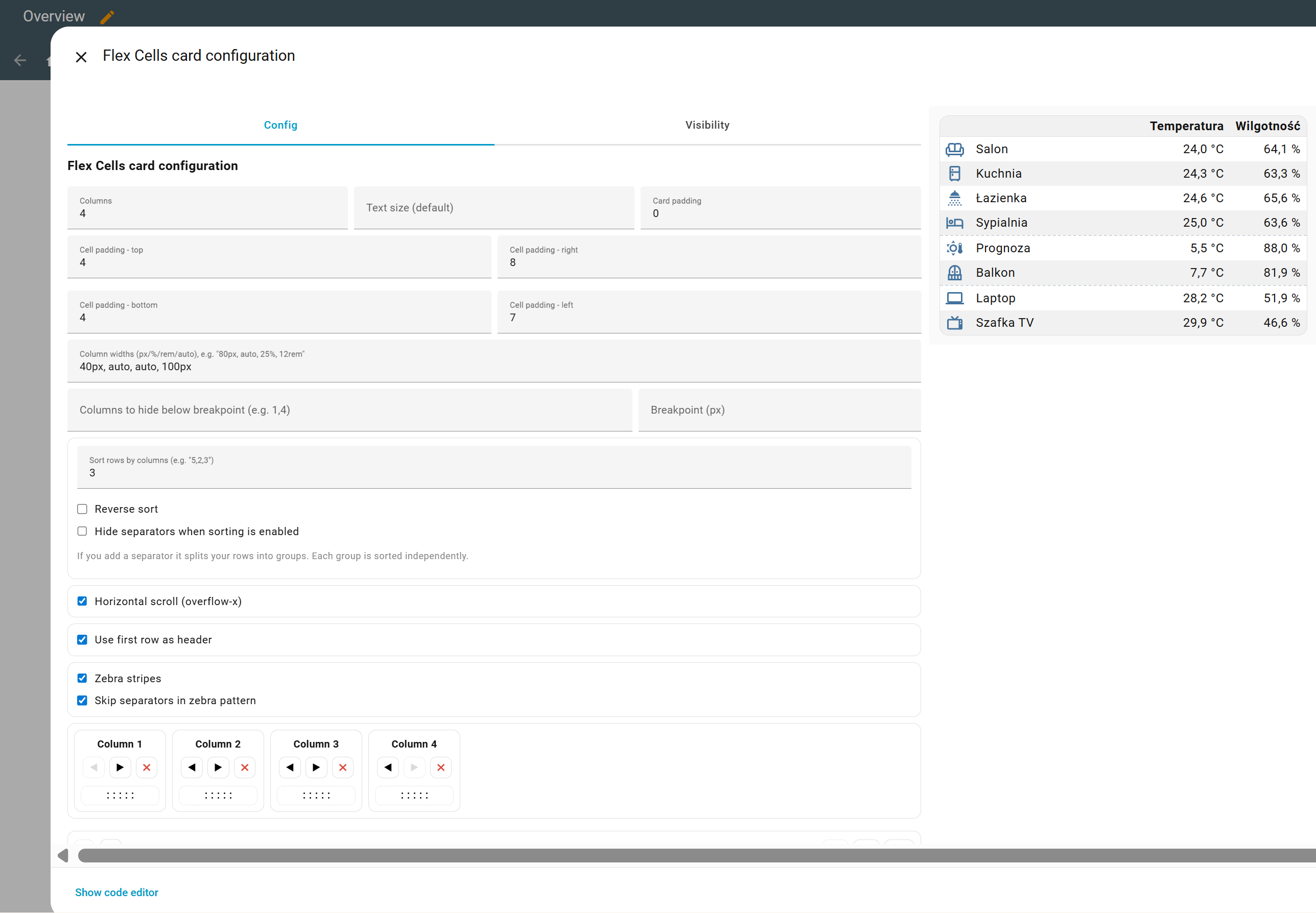
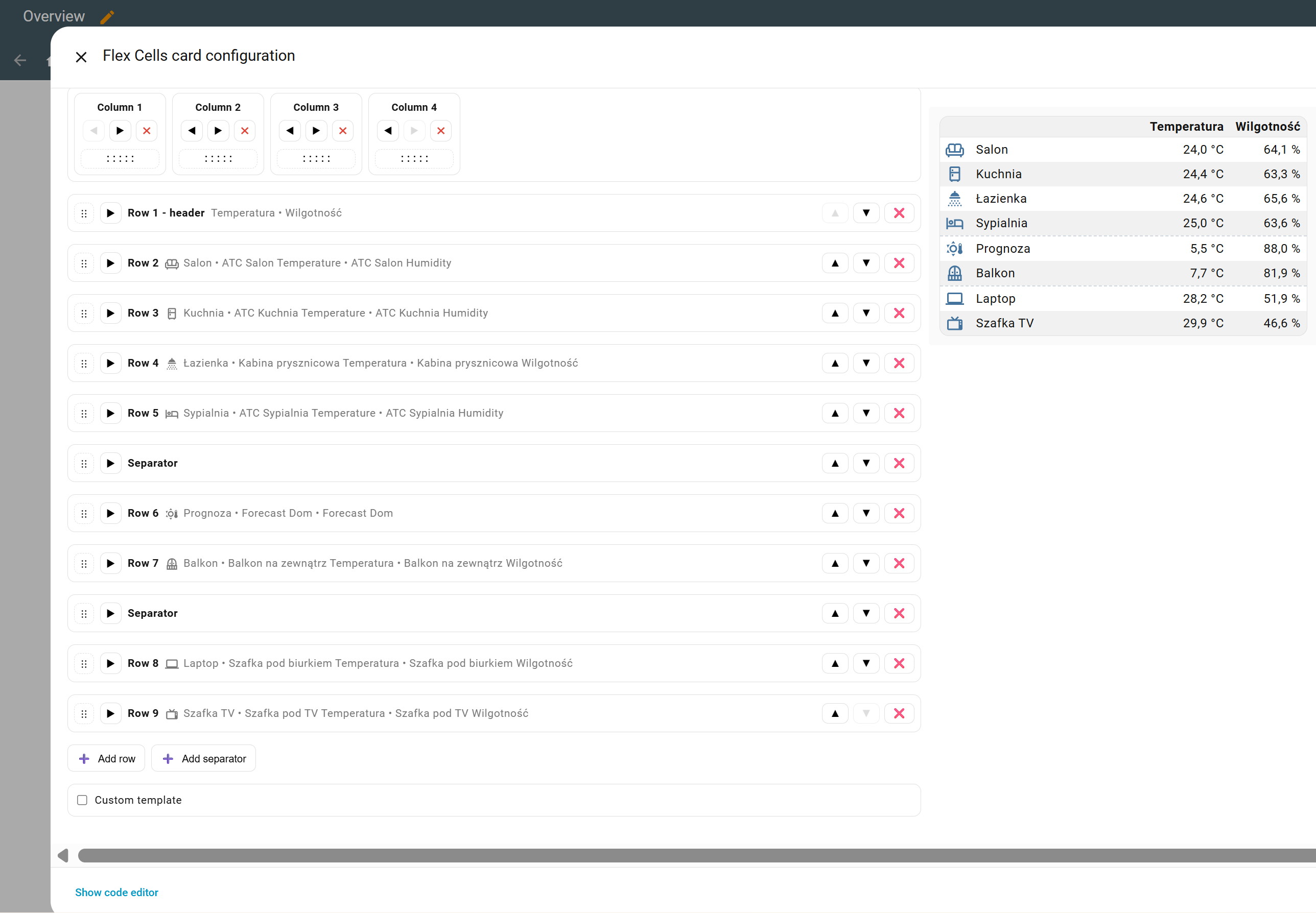
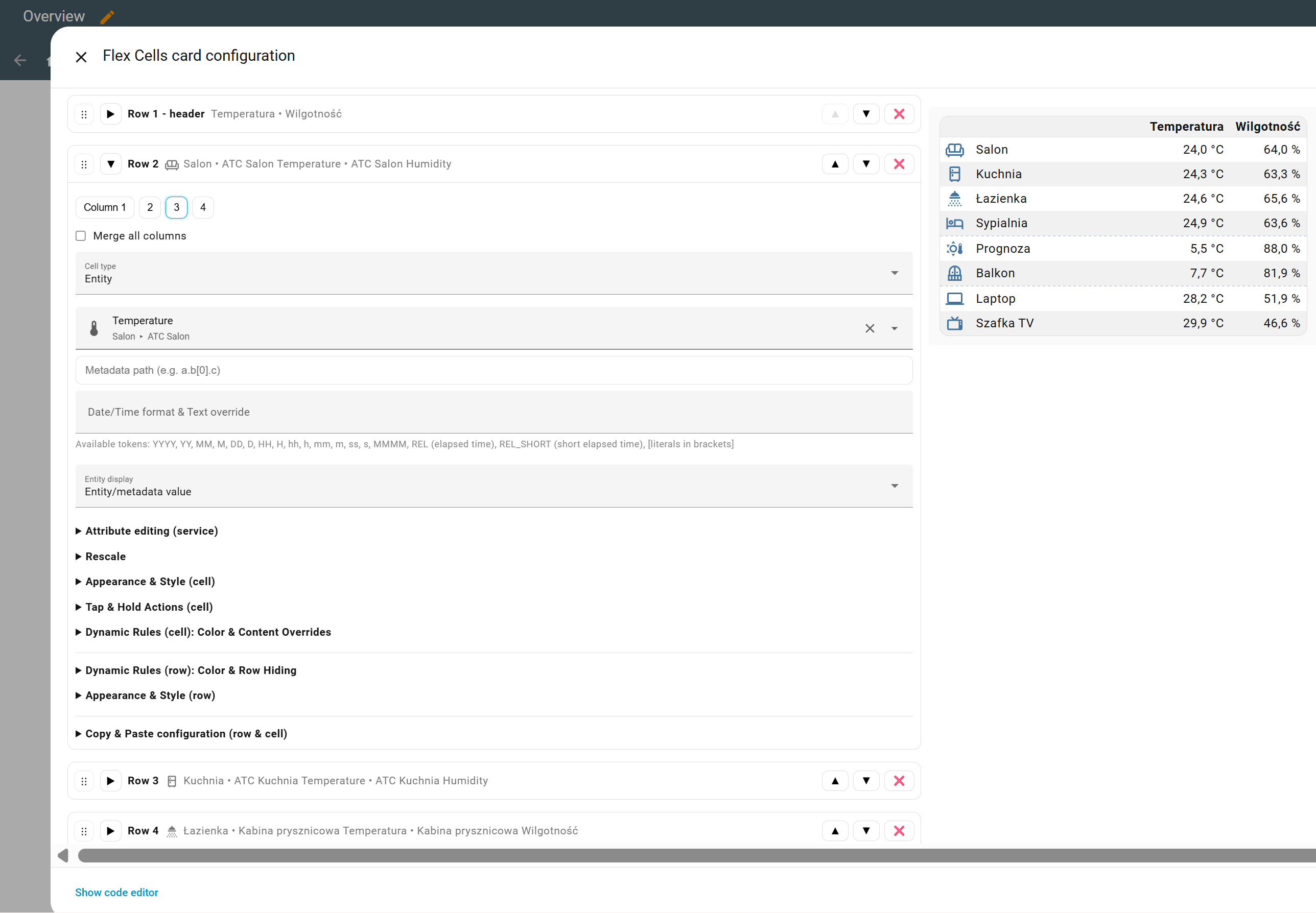
Flex Cells Card
A Lovelace card for Home Assistant that lets you add icons, text, entities, attributes, or input controls in flexible cell layouts — fully configurable from a visual editor (EN/PL/IT/DE), so no documentation is required to get started.
If you like this card, please consider giving it a ⭐ on GitHub: 
Features
- Mix cells with Icon / Text / Entity / Metadata / Input Control
- Dynamic Rules: Color & Content Overrides
- Sorting by one or more columns in one or more groups
- Using icons and colors assigned to entities by the system
- Per-cell actions: tap, hold, double-tap (mobile-friendly)
- Per-cell alignment, text transform, color, size, letter spacing
- Entities with unit handling and optional precision
- Visual editor, drag-and-drop rows/columns, zebra rows, responsive columns
- HTML templates thanks to which the card can look exactly as you want (HTML and CSS knowledge required)
- Each cell and row allows you to configure custom CSS, you don’t need to use “card_mod” for this
Installation
Choose one installation method, via HACS or manually.
HACS
- In HACS use the search bar and type Flex Cells Card.
- Install the card.
- The resource is added automatically as
/hacsfiles/flex-cells-card/flex-cells-card.js. - Reload browser cache or refresh resources in Home Assistant if needed.
Manual
- Download
flex-cells-card.jsfrom the latest release and place it under
config/www/flex-cells-card/flex-cells-card.js. - Add a resource in Edit Dashboard → ⋮ → Manage resources:
/local/flex-cells-card/flex-cells-card.js(type: JavaScript module). - Hard refresh the browser.
Compatibility: Flex Cells Card ≥ v0.23.0 requires Home Assistant Core ≥ 2026.2 (MD3 frontend). On older cores the visual editor dropdowns will not work; use an earlier FCC release if you must stay on an older HA version. For Home Assistant Core ≥ 2026.5, use Flex Cells Card ≥ v0.25.0 because older FCC editor builds depended on Home Assistant’s removed
ha-textfieldcomponent and may show missing text inputs.
Usage
Add the card in the UI and configure everything from the visual editor.
Video
Olli from the YouTube channel @smarterkram recorded a video explaining this card. If you know German, I encourage you to watch it https://www.youtube.com/watch?v=oh36grjbPDQ
Tips & Tricks
- How sorting works
- Sorting works “after applying” dynamic rules, meaning what’s visible is sorted.
- Sorting works even if the column being sorted is hidden (breakpoint).
- Dynamic rules
- If you see the value “null” for an attribute in developer tools and want to use it in dynamic rules, don’t enter “null” but leave value input empty. Empty means “null”.
- Available colors
- You can specify colors in various formats, one of which is variables, for example “var(–state-active-color)”. You can find a list of variables at this link.
- Search & Replace
- If you want to perform the same action on multiple rows/cells, use the code editor and the “search & replace” function - to see additional options press Ctrl + F in code editor. For example, if you want to remove all underlines, search for “underline: true” and replace it with “underline: false”.
- Camera snapshots (refresh cadence)
- Applies only to
Entity display: Camera snapshot. - Precedence: per-cell
camera_snapshot_ttl_ms→ if empty, use card-levelcamera_snapshot_ttl_ms→ if neither set, default is 5000 ms. - TTL controls how often the card asks HA for a new snapshot (adds a cache-buster); it does not change how/when the camera itself captures frames.
- Applies only to
Metadata paths
For entity cells, the attribute field is a metadata path. It can read:
- state-object fields such as
state,entity_id,last_changed,last_updated, andcontext; - entity attributes directly, for example
friendly_name,unit_of_measurement, or nested paths likeattributes.brightness; - Home Assistant registry data:
area.*,device.*, andentity_registry.*.
This lets you display an entity’s area without creating a template sensor:
rows:
  - cells:
      - type: entity
        value: sensor.bedroom_temperature
        attribute: area.name
        use_entity_unit: false
Common registry shortcuts are also exposed as area_name, area_id, device_name, and device_id.
Templates
Card-level (global) template
-
Templates, in addition to standard HTML tags, support their own tag:
<fcc row="3" col="5" />- insert a specific cell.
<fcc row="3" />- insert a specific row.
<fcc />- insert the full table exactly as FCC would render it (handy for wrapping with your own CSS):<style> /* custom styles for the whole table */ </style> <fcc /> -
If you want a non-fcc-table element to be dynamic (for example, a
<div>), you can use themode="text"attribute (aliasas="text") for a text-type cell. For example, you can set a dynamic rule like this:- cells: - type: string value: "display: none;" align: left style: text_transform: "" dyn_color: - entity: light.hue_bulb attr: "" op: "=" val: "on" overwrite: text text: "display: flex;"<div style="<fcc mode='text' row='1' col='1' />"> test </div>
Per-cell templates
- Each cell can render its own HTML when
custom_template_enabled: true. - The same
<fcc>tag works inside a cell template;row/colnumbering follows your YAML order (not the current sort order). - Use
mode="text"(oras="text") when you only want the plain text value of a cell (e.g., for<img src="...">). - Custom CSS, dynamic rules, and actions defined on the referenced cells are preserved.
Example (two cells embedding each other and reusing an entity picture):
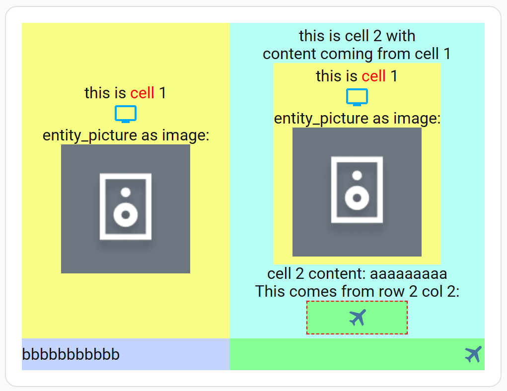
rows:
  - cells:
      - type: entity
        value: media_player.lg_webos_smart_tv
        align: center
        custom_template_enabled: true
        use_entity_unit: true
        entity_display: icon
        tap_action:
          action: toggle
        custom_template_html: |-
          this is <span style="color: red">cell</span> 1
          <br/>
          <fcc row="1" col="1" />
          <br />
          entity_picture as image:
          <br />
          <img src="<fcc row='1' col='1' as='text' />" />
        attribute: entity_picture
        style:
          background: "#f7ff85"
      - type: string
        value: aaaaaaaaa
        align: center
        style:
          background: "#b8fff3"
        custom_template_enabled: true
        custom_template_html: |-
          this is cell 2 with<br />content coming from cell 1
          <br/>
          <fcc row="1" col="1" />
          <br/>
          cell 2 content: <fcc row="1" col="2" />
          <br />
          This comes from row 2 col 2:
          <br />
          <fcc row="2" col="2" style="width: 100px; text-align: center; border: 1px dashed red;" />
  - cells:
      - type: string
        value: bbbbbbbbbbb
        align: left
        style:
          background: "#c2d4ff"
      - type: icon
        value: mdi:airplane
        align: right
        style:
          background: "#85ff93"
    dyn_row_rules: []
column_count: 2
card_padding: ""
overflow_x: true
header_from_first_row: false
zebra: false
narrow_breakpoint: ""
text_size: ""
cell_padding:
  top: 4
  right: 0
  bottom: 4
  left: 0
custom_template_enabled: false
custom_template_html: ""
type: custom:flex-cells-card
Examples
-
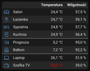
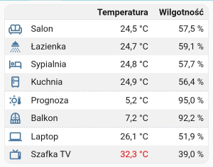
Temperature/Humidity - a simple table divided into three groups, with sorting by the temperature column performed independently in each group. Here you’ll find the simplest example of a dynamic rule that changes color to red when the temperature exceeds a specified value. Read more…
-
Multifunction card (cell templates) - this example shows how cell templates can be used. Read more…
-
Media Player (global template) - FCC template example (HTML, CSS). Read more…
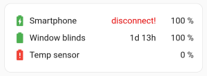
-
Batteries - displaying the device’s battery status. An example of using dynamic rules to overwrite an icon when an entity doesn’t provide it correctly. Read more…
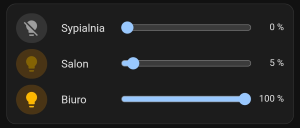
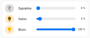
-
Slider Lights (custom CSS) - brightness control, on/off, display more-info. Read more…
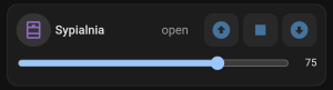
-
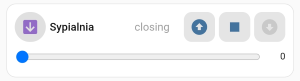
Cover (custom CSS) - window blind control. Read more…
-
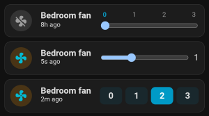
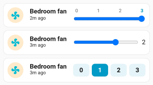
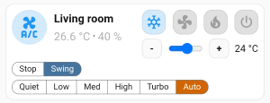
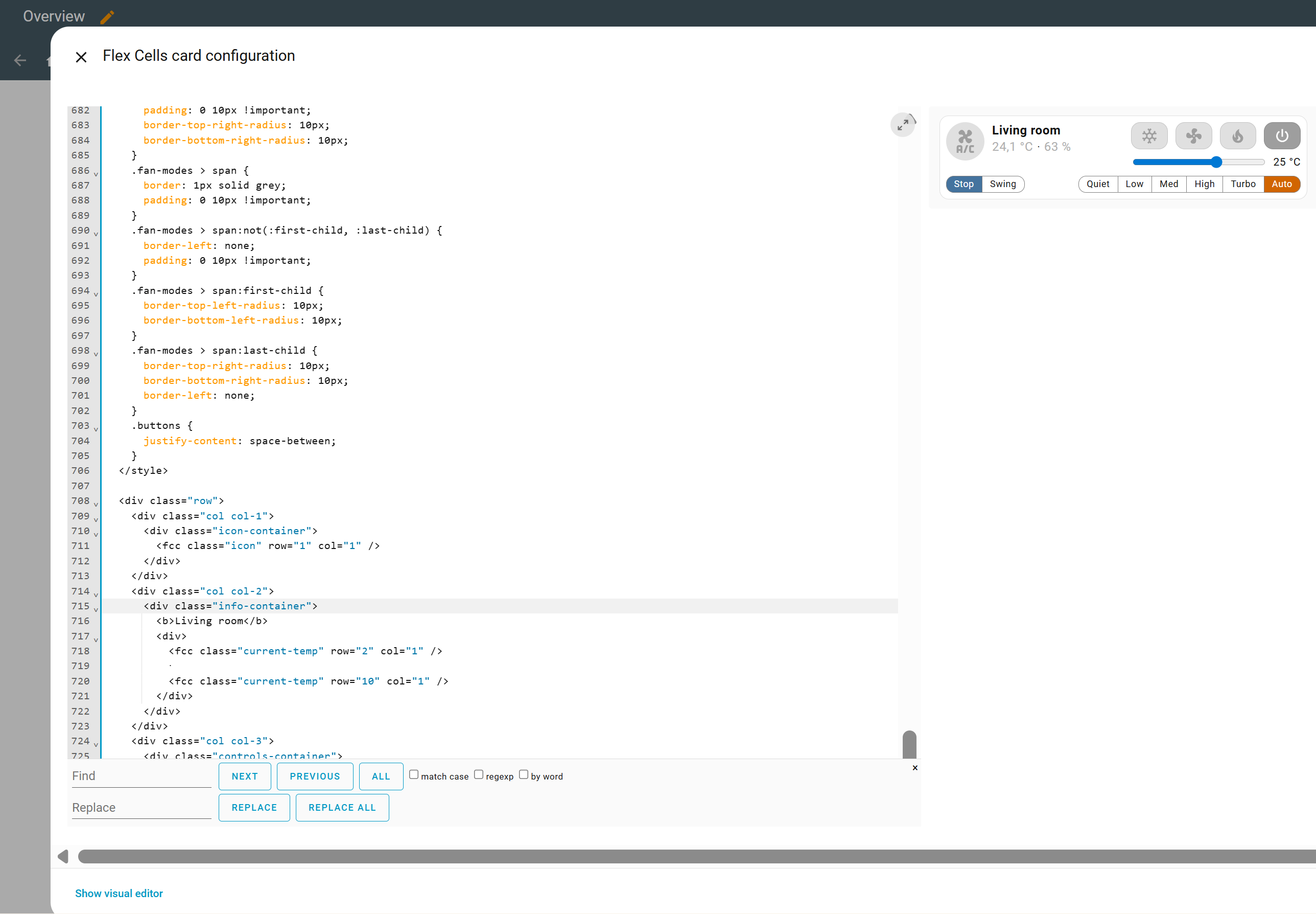
Fan - fan speed control examples using a slider, speed buttons, custom CSS, and cell templates. Read more…
-
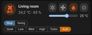
Climate (global template) - another example of an FCC template (HTML, CSS). Read more…
-
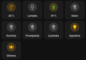
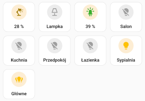
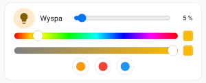
Button lights (custom CSS) - turning on/off lighting, setting color/brightness. Read more…
-
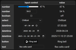
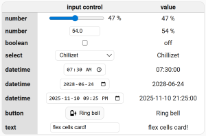
Input controls - this is only a presentation of the appearance of the FCC controls. Read more…
-
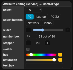
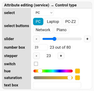
Attribute editing controls - a presentation of controls available in Attribute editing (service), including select, buttons, slider, number, stepper, switch, color, and text controls. Read more…
-
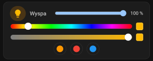
Hue and saturation (simple global template & custom CSS) - an example of using sliders to control hue and saturation. It also demonstrates how to use presets for lighting. Read more…
-
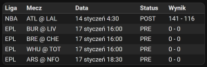
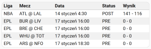
Sports table - tracking sports data using auto-entities and TeamTracker. Read more…
-
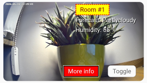
Camera - here you’ll find the simplest example displaying the camera image across the entire card, as well as two examples with additional buttons/information overlaid on the camera image. Read more…

-
Select (custom CSS & cell template) - list example. Appearance styled after the “Mushroom Select Card”. Read more…

Translations
If you’d like to help translate FCC editor, or improve an existing translation, please do so! You don’t have to translate everything - just one string will do - and it’s not difficult.
Quick start for translators:
- Open the Crowdin project and log in.
- Pick your language (or request it if it’s missing - note that the
Request New Languagebutton doesn’t work, so you have to let me know via forum or GitHub). - Translate a few strings in any language and save - partial translations are welcome.
- Finally, apply the
Unsaved Translationsfilter to each edited language, and if anything displays there, save it. Any unsaved translations will not be included in the project!
Auto-entities
Experimental feature! I do not plan to evolve it to parity with full FCC. With auto-entities you lose:
- per-row features (separators,
merge_columns,dyn_row_rules, custom row CSS/classes, row-level actions), - mixed/multi-row layouts (e.g., custom headers, separators between groups),
- the FCC visual editor (you see the auto-entities editor; the row template is YAML-only).
FCC accepts an entities array (e.g., from auto-entities). If entities is present, FCC builds rows from it; classic rows keep working as before. Control the generated table with entity_row_template (optional header and cells). Tokens: @entity, @friendly_name, @name, @state, @attr:<attribute>, @icon, @area_name, @area_id.
Example with auto-entities:
type: custom:auto-entities
card_param: entities
card:
  type: custom:flex-cells-card
  entity_row_template:
    header:
      - type: string
        value: Icon
      - type: string
        value: Name
      - type: string
        value: State
    cells:
      - type: entity
        value: "@entity"
        entity_display: icon
      - type: string
        value: "@friendly_name"
      - type: entity
        value: "@entity"
  column_count: 3
filter:
  include:
    - domain: light
Date and Time Format Tokens
These tokens can be used in Date/Time format & Text override fields. The examples below use this raw value:
2026-04-05T13:03:07
Relative examples assume the current time is 2026-04-05T14:34:37 and the locale is English, so the raw value is 1 hour 31 minutes 30 seconds in the past. Relative output uses the Home Assistant language when available, then falls back to the browser locale.
| Token | Description | Example output |
|---|---|---|
RAW |
Outputs the original unformatted value exactly as it was read. | 2026-04-05T13:03:07 |
YYYY |
Outputs the four-digit year. | 2026 |
YY |
Outputs the two-digit year. | 26 |
MMMM |
Outputs the localized full month name. | April |
MM |
Outputs the month number with a leading zero. | 04 |
M |
Outputs the month number without a leading zero. | 4 |
DD |
Outputs the day of month with a leading zero. | 05 |
D |
Outputs the day of month without a leading zero. | 5 |
HH |
Outputs the 24-hour clock hour with a leading zero. | 13 |
H |
Outputs the 24-hour clock hour without a leading zero. | 13 |
hh |
Outputs the 12-hour clock hour with a leading zero. | 01 |
h |
Outputs the 12-hour clock hour without a leading zero. | 1 |
AMPM |
Outputs the uppercase 12-hour period marker. | PM |
ampm |
Outputs the lowercase 12-hour period marker. | pm |
mm |
Outputs minutes with a leading zero. | 03 |
m |
Outputs minutes without a leading zero. | 3 |
ss |
Outputs seconds with a leading zero. | 07 |
s |
Outputs seconds without a leading zero. | 7 |
REL |
Outputs a localized elapsed duration with up to two units and no past/future direction. | 1 hour 31 minutes |
REL_SHORT |
Outputs a localized short elapsed duration with up to two units and no past/future direction. | 1h 31m |
REL_SHORT_AGO |
Outputs the same precise short duration as REL_SHORT, with localized past/future direction. |
1h 31m ago |
REL_SHORT_ROUNDED |
Outputs a rounded one-unit short duration with no past/future direction. | 2h |
REL_SHORT_AGO_ROUNDED |
Outputs a rounded one-unit short duration with localized past/future direction. | 2h ago |
[literal text] |
Outputs text inside brackets literally, without parsing it as tokens. | Pattern [Updated: ]YYYY[-]MM[-]DD gives Updated: 2026-04-05 |
Changelog
- v0.27.0 —
- Added Home Assistant registry metadata for entity cells, including
area.*,device.*,entity_registry.*, plus@area_name/@area_idtokens for auto-entities.
- Added Home Assistant registry metadata for entity cells, including
- v0.26.0 —
- Added step controls: attribute-editing sliders and native
input_number/numbersliders can show optional+/-buttons with configurable button position; attribute editing also supportscontrol: stepper, which renders- value +without a slider. - Added number box for attribute editing:
control: numberrenders a numeric input and sends the value when the field is committed. - Added text box for attribute editing:
control: textrenders a text input and sends the value when the field is committed. - Added select control for attribute editing:
control: selectcan render dropdown options from a configured attribute path (for examplesource_list) and call the configured service/field with the selected value. - Added select buttons for attribute editing:
control: buttonsuses the same options/service/field setup asselect, but renders short option lists as buttons. - Added
REL_SHORT_AGOtoken, using the same precise duration asREL_SHORTwhile adding the localized past/future direction. - Added
REL_SHORT_ROUNDEDandREL_SHORT_AGO_ROUNDEDtokens for rounded one-unit relative times, e.g. values over 60 seconds are shown in minutes instead of appending seconds. - Added
AMPMandampmtokens for 12-hour time formats. - Improved relative time tokens by treating values within 2 seconds of the current time as
now, avoiding brief clock-skew jumps such as1s → now → 1s.
- Added step controls: attribute-editing sliders and native
- v0.25.0 —
- Added camera entity display modes:
camera_streamandcamera_snapshot, also usable in dynamic rules. - Added per-card
camera_snapshot_ttl_msplus per-cell override to control snapshot refresh/caching (default 5000 ms). - Added optional sizing for camera cells via
camera_height(px number, e.g.,200) orcamera_aspect(e.g.,16:9or16/9), also available in the visual editor. - Added per-action confirmation dialogs for tap, hold, and double-tap actions, with separate title and message fields.
- Fixed missing visual editor text fields on Home Assistant 2026.5+ by replacing the removed
ha-textfielddependency with an FCC-owned text field component. - Fixed localized entity state formatting for both select option lists and dynamic
overwrite: entity. - Improved the card editor visuals.
- Added camera entity display modes:
- v0.24.0 —
- Added custom HTML templates for each cell. You can embed the same or different FCC cells using
<fcc row="x" col="y" />while preserving actions, dynamic rules, and custom CSS. This allows you to place more than one element in a single cell. - Fixed row/col recalculation for
<fcc>tags (and sort column numbers) when rows/columns are reordered or deleted in the visual editor. - Fixed ghost clicks on mobile after
navigate/urlactions by suppressing the first synthetic click for a short window.
- Added custom HTML templates for each cell. You can embed the same or different FCC cells using
- v0.23.0 —
- Updated visual editor dropdowns to the new MD3
ha-selectAPI (uses.options). - Fixes broken select menus on the latest Home Assistant Core.
- Requires Home Assistant Core ≥ 2026.2 (MD3 frontend); older cores are not supported by this editor version.
- Updated visual editor dropdowns to the new MD3
- v0.22.0 —
- Added optional text field and icon color picker for dynamic “Overwrite with icon” rules (both optional).
- Entity states now show the same translated labels as built-in HA cards (no more raw “on/off”), while dynamic rules still use the original raw value so your conditions keep working.
- Fixed entity icon color defaulting to Home Assistant icon color when no state-specific color was provided.
- Fixed number inputs (box mode) so they stay stable while you type and only send changes after you finish or use the arrows, matching default HA cards; for whole-number steps the displayed value no longer shows a trailing “.0”.
- v0.21.0 —
- Added experimental
entitiessupport (auto-entities/monster-card style) withentity_row_templateand token substitution; legacyrowsremain unchanged. - Added Italian translation, thanks to echopage1964.
- Added experimental
- v0.20.0 —
- Added sliders for hue and saturation.
- Integrating FCC with crowdin.com.
- v0.19.0 —
- Added proper ha-card wrapper and removed the custom border so the card behaves like a normal Lovelace card (e.g., looks correct inside vertical-stack-in-card). Kept the “card” class intact, so any existing CSS targeting it should still work.
- Added RAW token to “Date/Time format & Text override” so you can inject the unformatted value; e.g., set the format to “[light is: ]RAW” to render “light is: on”.
- Fixed FCC template parsing to only consider “mode/as” attributes for “text” mode and accept row/column values in single quotes.
- v0.18.0 —
- Added attribute editing using slider and switch.
- v0.17.0 —
- Added “AND/OR” logical operators in dynamic rules.
- Added new fields in dynamic cell rules for the “Overwrite with entity/metadata” option: Date/Time format & Text override, Entity display, Rescale.
- Fixed an issue related to changing the number of columns and the disappearance of unsaved dynamic rules.
- Fixed an issue related to the column width for the “auto” value.
- v0.16.0 —
- Added advanced copy and paste of table configuration.
- v0.15.0 —
- Added custom HTML templates.
- Added custom CSS for cells and rows (also works in templates), “card_mod” is no longer needed!
- Added new domains. The existing list of domains (input_boolean, input_number, input_select, input_button, input_datetime, input_text) that the editor considers as “input controls” has been expanded with new ones: switch, number, select, button, datetime, date, time, text.
- Added REL and REL_SHORT tokens in the “Date/Time format & Text override” field, they return a localized description of the time elapsed (full and short).
- Added support for “mode” variable for input_number. Now you can render a box in addition to the slider.
- Added ability to hide values next to the slider (input_number).
- Improved “Nothing” behavior in “Tap & Hold Actions”.
- Fixed separator width when breakpoint hides column.
- Improved clickable area on “Show control” and “Use unit from entity” labels.
- v0.14.0 —
- Added column merging.
- Added entity/metadata overrides.
- v0.13.0 —
- Added separators and sorting by groups.
- Added dynamic rules for the entire row.
- v0.12.0 —
- Added metadata (instead of attributes), now we have access to all data.
- Improved “Text size (default)” in the main settings, it no longer affects icon size.
- Added icon size settings (entity-derived icon).
- Changed “Date/Time format” to “Date/Time format & Text override”. Now we can override the entity value even if it doesn’t contain a date/time.
- Minor visual improvements.
- v0.11.0 —
- Added use of system-assigned icons and colors for entities.
- Changed the decimal separator to use the system settings.
- Disabled the default underline for entities.
- v0.10.0 —
- Added dynamic sorting by single or multiple columns.
- Added a “tips & tricks” section to the readme.md.
- Fixed the dropdown list display in dynamic rules.
- v0.9.0 —
- v0.8.0 —
- Added formatting for input_datetime.
- v0.7.0 —
- Added controls for input types: boolean, number, select, button, datetime, text.
- Added “Appearance & Style” section in the card editor for easier navigation.
- v0.6.0 —
- Added dynamic icons.
- v0.5.0 —
- Added dynamic coloring/hiding/masking.
- Minor visual improvements.
- v0.4.0 —
- Added entity attributes with per-attribute rescaling (Input/Output min/max).
- Fixed tap & hold so secondary actions (e.g., setting brightness) work alongside the primary action.
- Fixed header/last row background overflow when card padding is set to
0.
- v0.3.0 —
- Added inline color picker with live preview.
- v0.2.0 —
- Added per-cell actions: tap / hold / double-tap.
- v0.1.x —
- First basic release of the card.
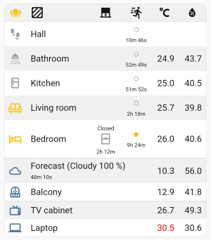
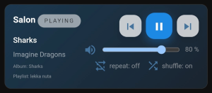
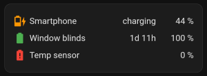
Screenshots
Example YAML
type: 'custom:flex-cells-card'